I’ve been blessed once more by the benevolent folks at Sox On 35th to share some exciting news (as well as a few new fitted concepts) with all the South Siders out there. The last time we…um…talked, I shared some White Sox fitted hat concepts and mentioned that I aspired to see some of my designs turn into tangible real-life hats that one could purchase. I’ve been mesmerized by all of the aesthetic beauty in sports for as long as I can remember and feel there are few things more eye-pleasing than a thoughtfully designed fitted cap with puff embroidering.
Anyway, this small goal turned into an out-and-out obsession and since the early summer of 2021, I have shared a new fitted hat concept on Twitter and/or Instagram just about every weekday, often times posting a few of them a day. Hey, any excuse to blow off my real job, am I right?
Well, I am extremely pleased to report that my first set of designs to make it to production drop today (Wednesday 3/23) at 12:00pm CST with Grandstand Ltd, located right on…wait for it…35th Street! It’s fate! I am really thrilled to work with Grandstand, as Josh and Stephanie are feverishly devoted to the White Sox fans and the business has a strong philanthropic presence, as they constantly give back to numerous Chicago-based causes and charities. Beyond that, they always have an expansive inventory of gorgeous hats. Seriously, check out their site or store – it’s mind-blowing. Considering the theme and motivation behind the hats I am about to unsheathe, they really are the perfect company to partner with on this series.
Here is what we have cooking:
When I first started really getting into creating fitted caps, I focused designing hats that I felt hometown fans would want. That’s still my first priority and the ultimate goal, but I definitely had a more “traditional” slant early last year and tried to blend “history” “accuracy” and “fashion” (or to use a less-pretentious phrase, “stuff that looks good”). This was the driving force behind this collection, which all feature colors that have been used at some point by the team on the field and were made with Sox fans being the primary intended target.
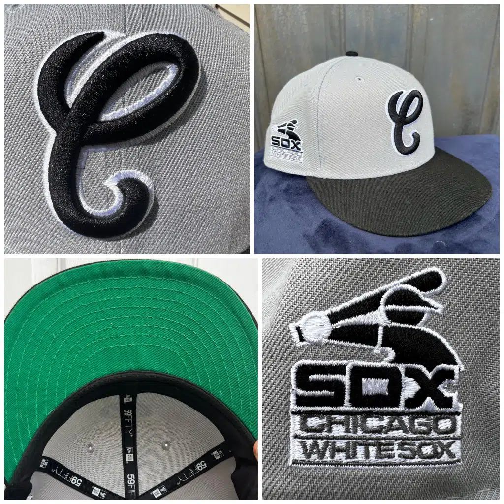
From what I’ve seen, the “cursive C” logo that the Sox wore from 87-90 has had a bit of a renaissance recently, much to the delight of fitted fans. The logo is used here, along with the wordmark the team employed from the same era as the “side patch”. The UV (“under visor”) is green, not just for a splash of color, but also to keep things consistent with the on-the-field caps of this era.
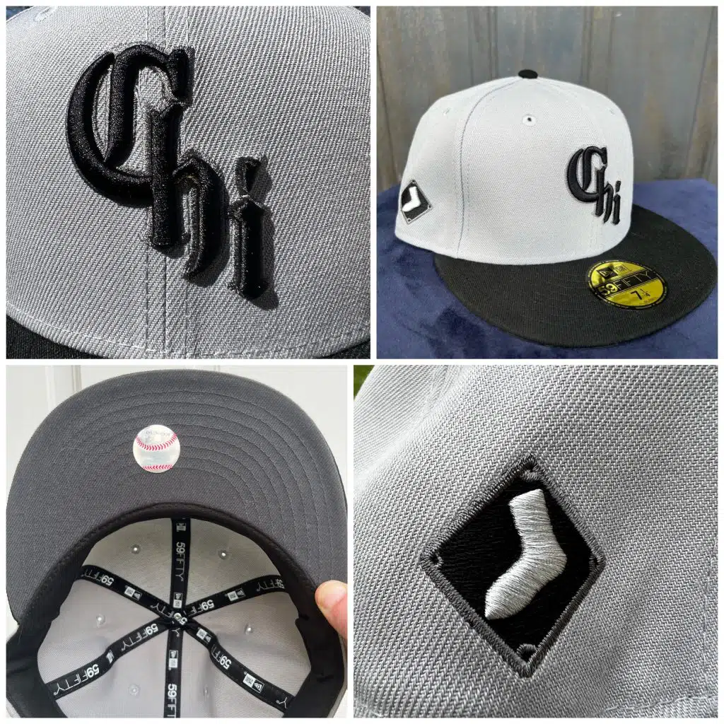
The City Connect jerseys the MLB released last season were polarizing to say the least. I’ve heard many people say that they felt all of the designs were botched…with one team being the exception. Can you guess who the team is? I’ll give you a hint – it rhymes with “Fight Box”.
I fell in-love with the “Chi” logo as soon as I saw it and wasted no time using it on some of my concepts.
I decided to mix together the Sox light gray with black to create this sort of “granite” like shade of gray on the exterior of the logo, as well as on the UV (which was an executive decision by Grandstand and a GREAT decision, I have to say). The dark brim and slightly-less-dark-but-still dark UV look really cool in-person. The side patch is a little different than many of the other caps being released right now. It’s much smaller, but I believe that will appeal to folks who perhaps feel the more intricate / flashy side-patches out there aren’t quite their style. That said, the smaller diamond-shaped Sox logo on the side does create some interesting opportunities for those who like to wear pins with their fitted hats.
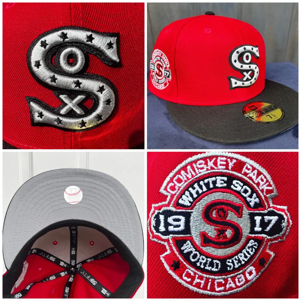
Lastly, we have an homage to the 1917 World Series champs, but with a more modern colorway (“modern” in the relative sense, as the team first wore this shade of red in 1939). We also added silver and black from the team’s colorful historical catalogue. The UV is light grey, as I felt anything else would make the cap a little too jumbled and distracting.
I am extremely grateful to Joe and the rest the team at Sox On 35th for inviting me back today to share these with you all. I hope you enjoyed them and please reach out to me on Twitter or Instagram if you decide to pick any up when they go on sale (again, Wednesday 3/23 at 12:00pm CST in-store and online at GrandstandSox.com). I’d love to hear from you!
B-B-B-BONUS CONTENT
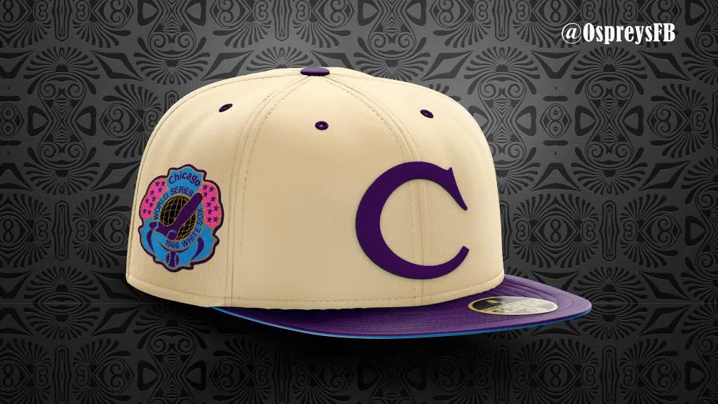
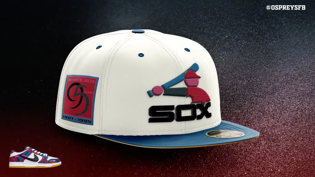
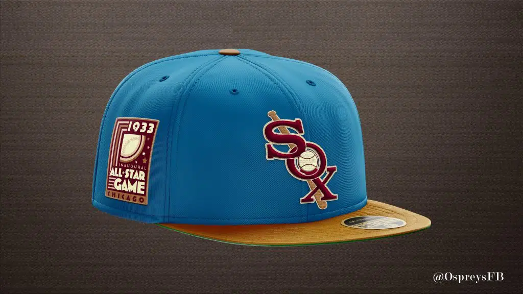
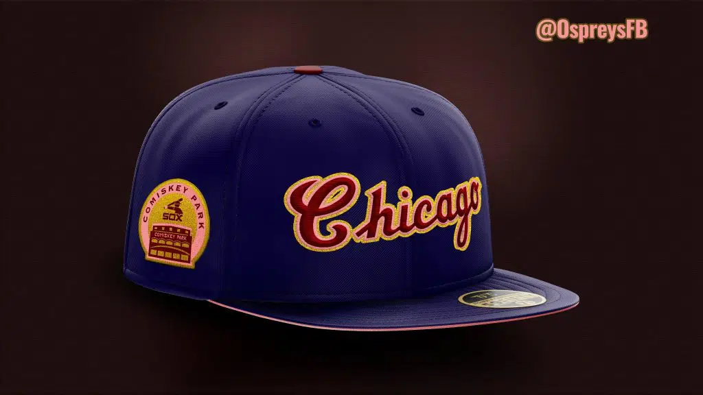
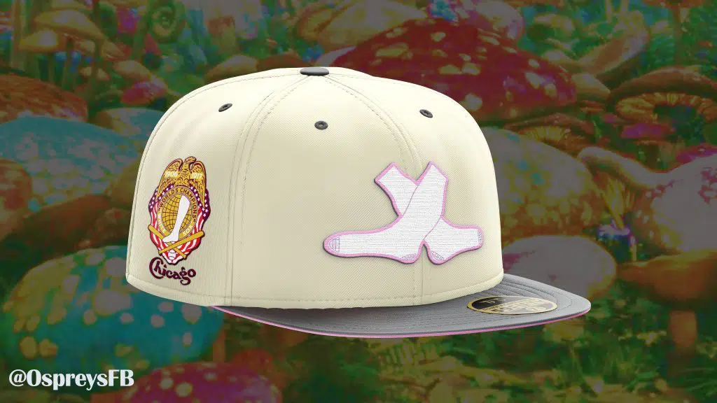
Here are a few other concepts I’ve shared online over the past few months. These haven’t received the Pinocchio treatment yet, so you can’t, you know…WEAR them, but you can at least look at them!
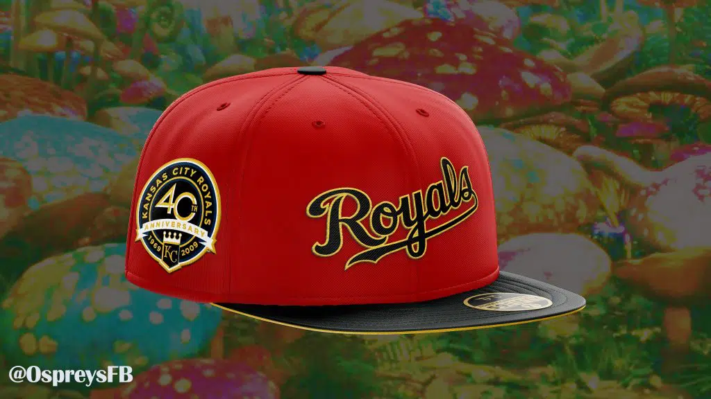
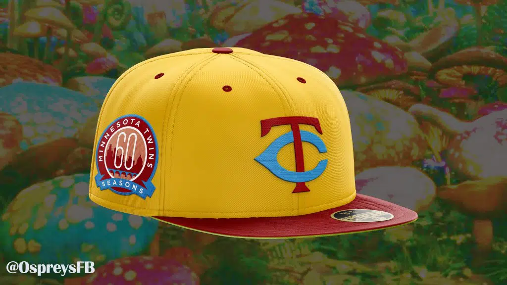
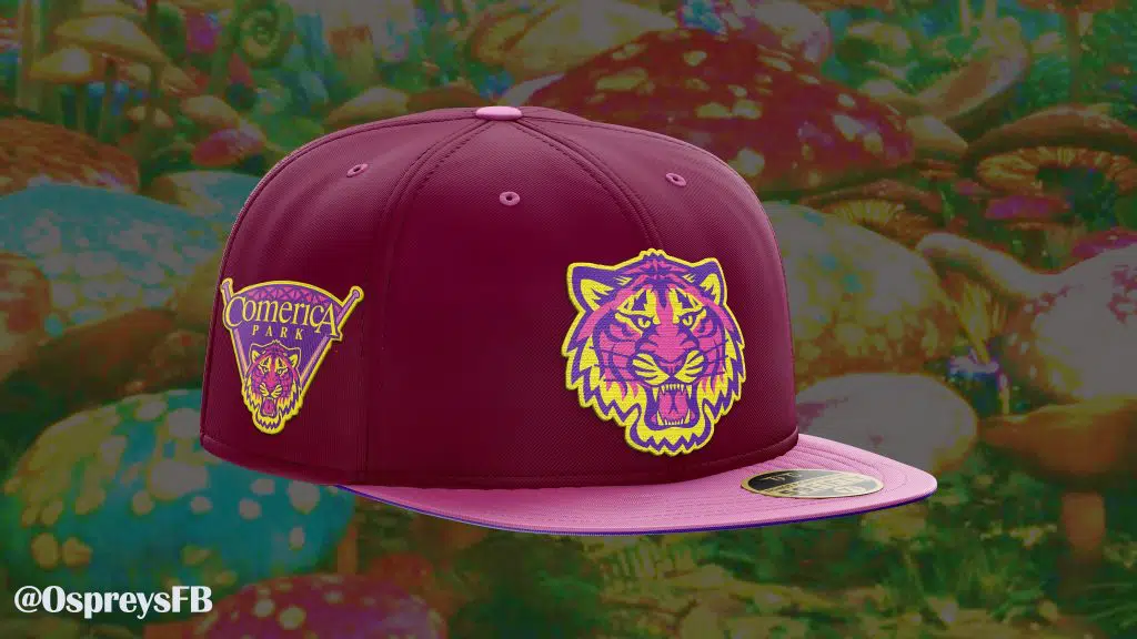
A few of these were designed “fashion first”, but the first image is intended to be an homage to the bright, beautiful colors from Disney’s 2017 masterpiece “Coco”. The last four are part of a small series of caps titled “AL Central in Wonderland” in which the Tigers represent the Cheshire Cat, the Twins are Tweedledee and Tweedledumb, the Royals are the Queen of Hearts and the Sox are fashioned after the White Rabbit.
Thanks so much for reading!
Be sure to follow us on social media @SoxOn35th for more updates!
Related articles:
Didn’t the Sox first wear that shade of red on their block C logo in 1901 and 1902?