Hey Chicago – I am absolutely thrilled to be back with another fitted cap showcase for Sox On 35th. Since the first installment a few weeks ago, the White Sox have gone 10-5, we learned aliens have been playing pranks on our military for years, Mike Tyson turned 55-years-old, and I was able to put together some more White Sox fitted hat concepts to share with you all. That’s really it. That’s all that’s happened.
The grouping of Sox designs featured here is a little more colorful than the first concepts, where I leaned more on the modern-yet-also-classic look of the Sox grey and black. Well, not only do the Sox have a staggeringly comprehensive set of logos and caps, but they also have a deep roster of colors in their team history. They’re really beautiful colors that all work together – navy blue from the EARLY years, white, grey, black, bright baby blue, silver, bright red – even yellow! There is so much exquisite material to work with in the Sox history. The only standard colors missing are purple and green and, guess what – your mascot is green, so even THAT color can be utilized while also staying somewhat true to the team’s identity.
Alright, let’s jump into it:
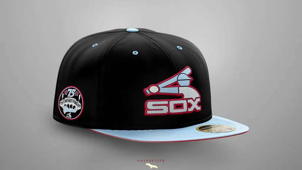
This one is a personal favorite. It features the iconic “Batterman” baseball player-logo the team used from 1976-1990 and pinstripes as a calling to the current uniforms, but shaded powder blue (like Bill Melton is sporting here) instead of black or white. The “Batterman” logo is one that resonates with fans for so many reasons. I think it perfectly encapsulates 70’s style. Let’s face it, the era that somehow managed to make brown and tan gaudy didn’t produce many other fashion choices that people would consider “timeless”, but this is one that holds up and is quite popular in the fitted hat collector community.
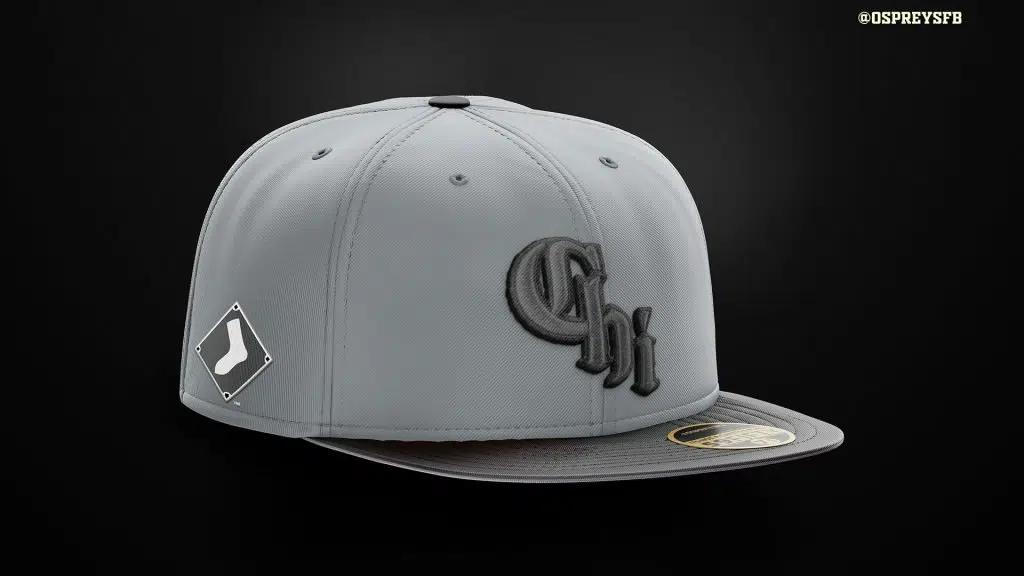
Fast-forwarding to the present day, the new City Connect uniforms were pretty well-received and I have to agree with the overall fan sentiment. In fact, I think the Sox hit a home run with these designs (get the joke guys? It’s a baseball joke. I can explain it later).
Anyway, I wanted to use the Chi logo in a way that didn’t depart too much from the team’s current bad-ass, black, white, and silver/gray scheme. I figured, if all three of those colors look great together, why not mash ‘em together into a dark grey? Joking aside, I could see the Sox rolling with this look and thought it didn’t go away too far from the general direction/intent of the City Connect theme.
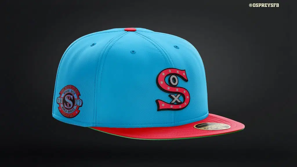
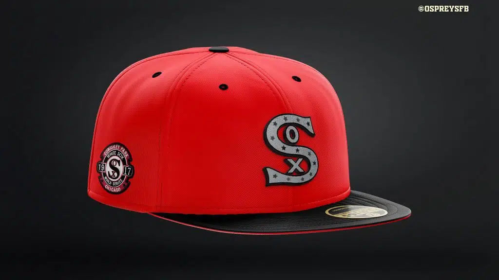
I admit it. I love powder blue. I also love the story of one of the most courageous athletes of the last 60 years, the recently departed, Phillies-and-Sox legend Dick Allen, who is wearing powder blue here AND here. I know that most baseball fans do not associate the Sox with anything other than white, black, grey, and maybe red, but I couldn’t help myself here.
These two Sox designs incorporate the embroidered jersey logo from the 1917 champs and one of the more pleasing World Series patches that I can remember coming across. Bringing together two sets of eras respectively, I used the lovely retro powder-blue-and-red scheme for one of the caps, and the other features the black-and-red combination the team wore in the 1950s.
By the way, speaking of the 1917 Champs, have you ever looked at some of the batting statistics from the “Dead Ball Era”? They are MIND-BLOWING. The Sox leading home run hitter in 1917 and had SIX home runs in 575 at-bats – the immortal Happy Felsch famously portrayed by Ricky “Wild Thing” Vaughn before he became a pitcher for the Indians 70 years later.
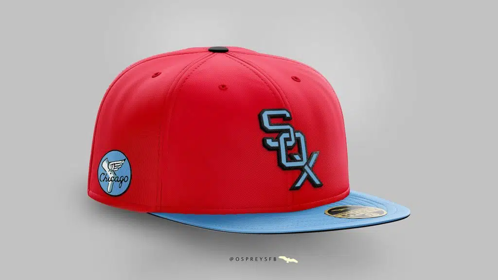
And just for good measure, here is another red-and-powder-blue cap, this one featuring the first version of the famous vertically-cascading SOX logo that the team wore in the 1950s and 1960s. The side patch is a recolored version of the yellow-circle Sox logo that the team used for 21 years.
In my first post from a couple of weeks ago, I mentioned working with some Twitter followers who have come to me with ideas or themes that they’ve perhaps always wanted to see on a cap or jersey. One of those followers is Brock Howard (Twitter profile). Now, Brock is a Royals fan, but he is also a great guy, I swear! Additionally, he has a real knack for coming up with some killer fitted cap ideas and has worked with me on quite a few concepts. Here are two we brainstormed & mocked up together:
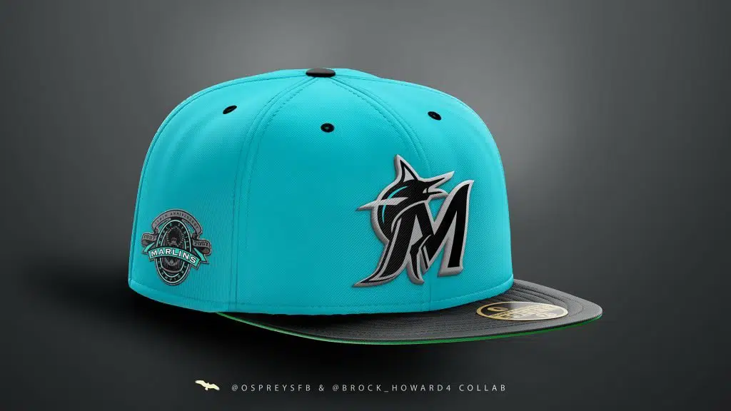
For the life of me, I don’t know why the Marlins ever moved away from their original teal uniform set. How can anyone justify going from this beauty to this? The Giant “M”, the departure from using a truly unique combination of teal and silver – I disliked everything about the change. The teams’ most recent on-field caps are a slight improvement, but Brock and I felt it was an easy choice to “teal-ify” these and bring back a little bit of the silver in the process. The side patch is a recolored version of this, which marked the ten-year anniversary of the team’s first World Series win.
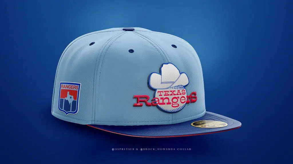
This Rangers cap is another collab effort from Brock and I and was pretty well-received by folks when we originally “dropped” it on Twitter. It features the Rangers’ primary logo from 1972-1981, which was never used on the team’s on-field caps. We opted to use the team’s red + powder/sky/baby/light blue color scheme, which reminded me a bit of the old Houston Oilers uniform sets. Once again, I love light blue and I am sorry, but I am not going to apologize for it.
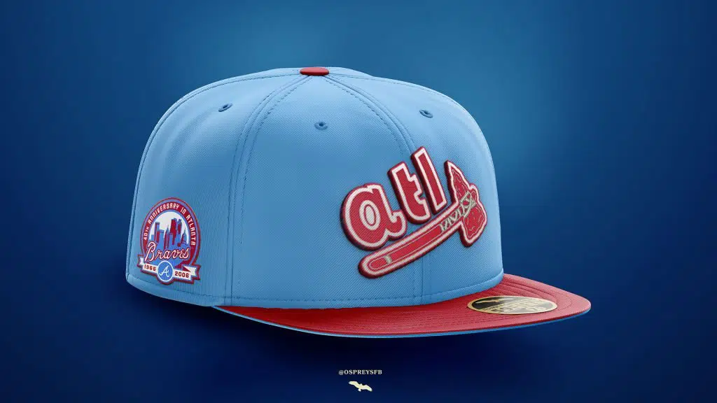
Truth be told, I feel a little funny about using Native-American-related imagery on any designs. The Braves’ use of the Tomahawk Chop chant always felt like an example of “casual racism” as opposed to a “respectful homage”. Unfortunately, the team’s entire visual identity is geared around using either the letter “A” or some sort of Native American-themed logos. Out of all of them, I felt the tomahawk itself was probably the most innocuous, so I used it here along with adding a “tl” in Bauhaus font. This cap isn’t perfect and probably can be tweaked a little, but I liked the idea and thought it would be popular with Braves fans, so I figured I’d include it.
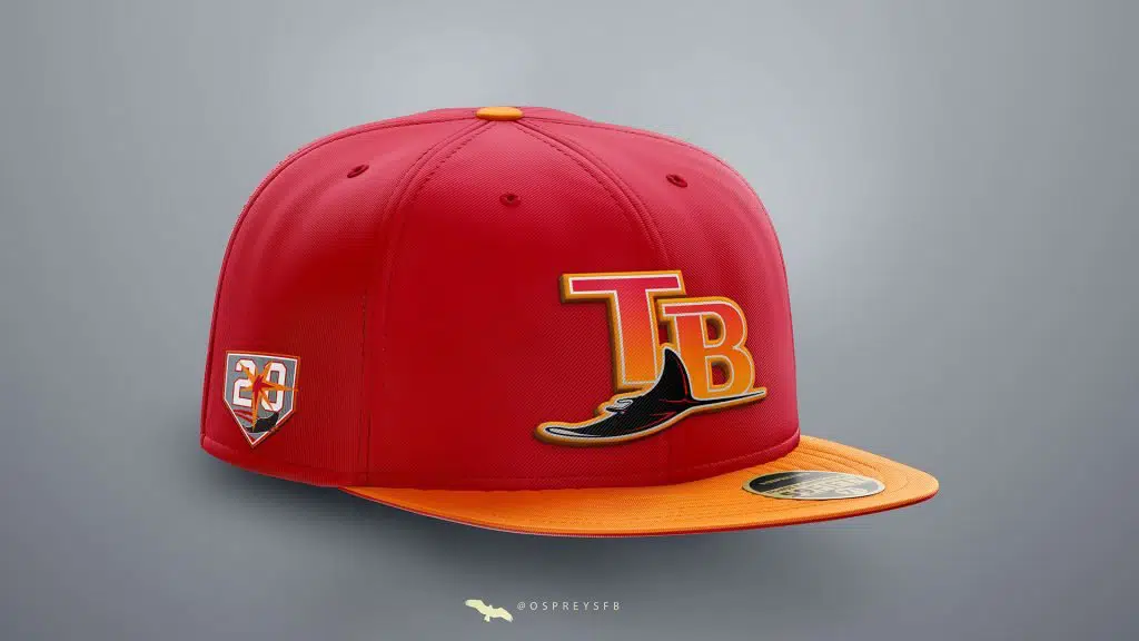
Finally, we have a Rays cap in the orange-red-and-white creamsicle scheme that the Tampa Bay Buccaneers wore for their first 20 seasons. It would not surprise me in the slightest if the Sox and Rays end up playing in the ALCS this year. The matchup wouldn’t exactly be a rating bonanza, but it would almost certainly be a compelling series, especially if you’re into pitching. I strayed a bit from my preferred method of using colors from each teams’ respective histories because…do you really need a reason? It’s the TB creamsicle colors, for Pete’s sake.
There aren’t many teams that involve a blended color/gradient look, and I like the end result here; swapping out the orange/green/purple/blue from the Rays inaugural logo with the Bucs’ orange and red.
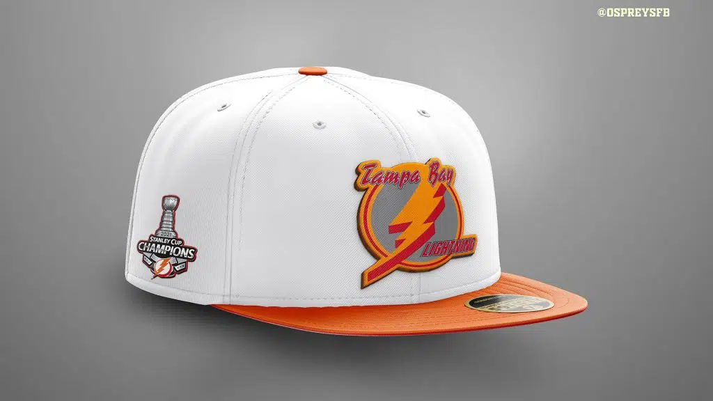
As a bonus, I included a similar cap for the back-to-back NHL champs using the same color scheme and a side patch for their most recent Stanley Cup.
Lastly, I mentioned this in the previous piece, but I have been a sports logo/uniform “nerd” for just about my entire life. When I was 12 or 13, you could have mailed an issue of Playboy to me and if it arrived the same day as the 1-800-Pro Team or Eastbay catalog, I’d have read those first. This goes without saying, but I get a lot of personal enjoyment out of creating these concepts and even more out of sharing them with you all.
After the first article, there was a steady flow of messages from Sox fans asking where they could buy real-life, fitted versions of some of my cap designs. I asked a few readers where they get their Sox merchandise and the name I kept hearing was Grandstand Ltd. (who have a CRAZY selection of Sox hats that is shockingly vast – seriously, I was worried I’d see a few of the hats I already made on there).
The feedback from you all inspired me to reach out to them and I’m pleased to report that it sounds like there is a chance a Sox concept-or-two may make it onto Grandstand’s shelves. Nothing is official, but I’ve been given their blessing to pass the news along to the Sox On 35th readers. Josh and Stephanie (Grandstand managing ownership) seem like incredibly nice people and are both VERY devoted to the fitted hat “world”, so needless to say, I am pretty excited to see where it goes (OK…really excited to see where it goes)
Without Joe Binder and the team at Sox On 35th, as well as the encouragement and feedback from the enormously supportive Sox community, I’m not sure this would be possible. Thank you.
Until next time, thank you for reading, and GO SOX!
PS: I wanted to give another “thanks” to Sportslogos.net as several of the links used in the article go right to their site. I recommend checking out their forums for lots of other cool design concepts that others have created over the years.
If you missed the first installment of Steve’s “Sox Cap Showcase,” you can read it here. Be sure to also give him a follow on Twitter @OspreysFB to see additional hat designs!
My man Osprey killing it ?