Written by Jonah Ward of “Dubya Design”
I am a big baseball fan, but admittedly, I am an even bigger sports uniform fan. I have made it my personal mission to create a mixtape concept for every single club in Major League Baseball. Included in those is the historic Chicago White Sox, a team that has had quite the rollercoaster of uniform changes over the last century. My mixtape concept is a way of telling just a small part of the team’s deep uniform history on a singular uniform.
Let me start by saying, I love the White Sox and their rich history of uniforms. For my mixtape concept, I may not have used some of their craziest elements, but I admire that they have even experimented with some unique concepts in the past. It has certainly made designing my mixtape for them a fun endeavor.
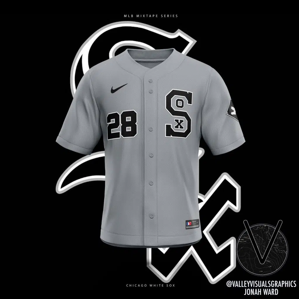
As pictured above and below, the mixtape is a remix of many eras all morphed into one new concept. If you are an avid Sox fan or a uniform lover, you may recognize a few familiar elements in this. If you don’t, allow me to explain the inspiration of this design further.
The Color Scheme
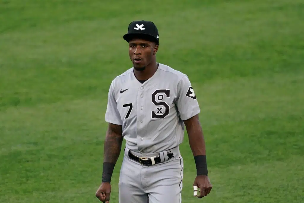
To preface this, I ultimately chose a color scheme of gray, black, and white because the White Sox have used many colors over their existence, including navy, royal, red, cream, and even powder blue. It goes on. To make things easier, the modern color scheme is what best exemplifies the Chicago White Sox because they have now set their identity in stone. All logos and colors were reverted to the modern color scheme in this concept for the sake of design.
The Logo
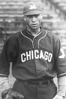
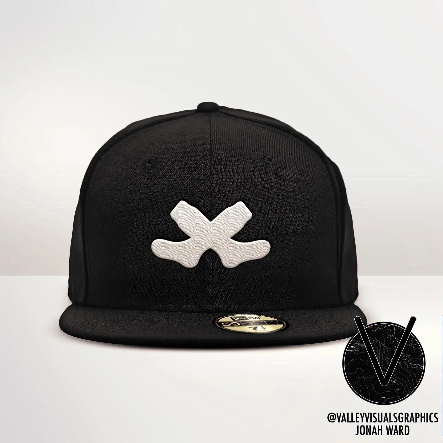
Our mixtape begins in 1926, with a rather obscure element for the White Sox; a double sock logo. Predominantly, the White Sox have used a singular white sock as their logo, but my mixtape concept isn’t about what is predominant – it is about what isn’t, as I am trying to create something we’ve never seen. So I took the double-sock logo and I ran with it, inserting it on both the cap and the sleeve.
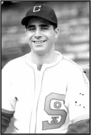
We then jump to their World War II-era uniforms, which feature a blockier rendition of their vintage “SOX” wordmark. I chose this wordmark because it’s a tasteful spinoff of the one we see in the “Field of Dreams.” This ’39-’48 era font has a timeless charm and could’ve worked on any White Sox uniform set. It looked sharp then and it does now.


In the mixtape uniform, I chose to place the numbers to the opposing side of the Sox logo, I take that element directly from the black jerseys they wear today. I also grabbed the diamond shoulder patch with the sock inside of it from the modern jerseys. I stuck the double sock inside of it to match the cap and to bring more changes to the mixtape concept.
The Jersey Inspiration
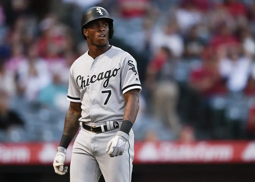
For the overall inspiration of the color scheme, I stuck to the road grays. I love the simple black elements with the thin white outlines. Naturally, I had to use them to create a realistic look.
With this White Sox mixtape, there were a lot of elements I could’ve played around with but chose not to. Here are some honorable mentions:
- The 1970’s pullovers
- The shorts experiment
- Their many color schemes
- Their current logo
I’d love to give a big thank you to Sox On 35th for showcasing my concept. If you’d like to check out more MLB uniform concepts and edits, follow me and let me know what you think.
- Instagram: @dubyagfx
- Twitter: @dubyagfx
- TikTok: @dubyadesign
The hat logo is awful as well as the sleeve patch. A better choice for the sleeve patch would have been the winged sock logo from the 1950’s. As for the hat…a “C” could work or simply repeat that jersey logo on the hat.
I think the Sox need more color since they use only black & white which aren’t colors on the spectrum. I would like to see them implement some red to go within that black & white like the “Go-Go” White Sox of the late 1950’s.
Those black pants they just wore are terrible, are they figure skaters or baseball players, going to be hotter than hell later in the summer too.
Best White Sox uniform was 1917 World Series which was worn only during Series.
When can i get a couple?
Really weird how none of your linked accounts actually exist. All are deleted.
Hi Scott – thank you for the callout. Valley Visuals was recently re-branded as “Dubya Graphics,” which is why none of the linked accounts were working. They have since been updated and are now working. Thank you again for bringing this to our attention!